
Activity vs Revenue Intersection — Reading Your Team’s Efficiency
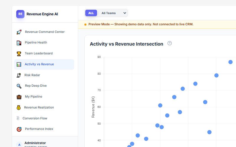
The Activity vs Revenue Intersection view plots your entire sales team on a scatter chart — activity level on the horizontal axis, closed revenue on the vertical axis — and instantly calculates whether that activity is translating into results. A companion Correlation Signal panel tells you what the data pattern means for your team as a whole, so you can act on the insight in seconds rather than spending time interpreting the chart yourself.
Reading the Scatter Chart
Each dot on the chart represents one sales rep for the currently selected date range:
- X-axis (Activity Level): Total logged calls and meetings linked to opportunity records during the period. Reps further right have higher activity volume.
- Y-axis (Revenue $K): Closed-won revenue for the same period. Reps higher up have closed more revenue.
The chart is unfiltered — every rep in scope appears as a dot. Use the Team filter in the header to narrow the view to a specific team and make individual rep positions easier to read.
What the dot positions mean
There are no fixed quadrant lines in the chart. Instead, read rep positions relative to each other:
- Top-right dots (high activity + high revenue): Reps who are working hard and converting that work into closed deals — your current top performers.
- Bottom-right dots (high activity + low revenue): Reps who are busy but not converting. High-value coaching opportunity — check deal qualification and closing skills via Rep Deep Dive.
- Top-left dots (low activity + high revenue): Reps closing revenue with below-average logged activity. Either efficient deal managers, or potentially under-logging calls. Check whether their activity is linked to opportunity records in SuiteCRM.
- Bottom-left dots (low activity + low revenue): Reps who are neither busy nor producing. Immediate 1:1 required. Use Risk Radar to check for inactivity flags.
Correlation Signal Panel
The Correlation Signal panel to the right of the chart summarises the statistical relationship between activity and revenue across your entire team for the current period. It gives you one clear verdict instead of requiring you to interpret the scatter pattern yourself.
Signal states
| Signal | What it means | Manager action |
|---|---|---|
| High Positive | Activity is directly driving revenue across the team — reps who are active are closing more. The team’s effort-to-output ratio is healthy. | Maintain the activity level. Focus coaching on reps in the bottom-right (high activity, low conversion) to improve their close rate. |
| Moderate Positive | Activity and revenue are correlated but not tightly. Some reps are closing without proportional activity; others are active but not converting. | Look for outlier reps on both sides. Review deal quality and pipeline stage distribution. |
| Low / Negative | Activity and revenue are weakly or inversely correlated. The team may be targeting the wrong deals, or activity is not being logged correctly. | Run a Data Health scan to check activity linking. Review whether reps are pursuing qualified opportunities or spending time on low-probability deals. |
When the signal reads “Recommend increasing volume for Mid-Tier reps”, it means the Correlation Signal is positive but the reps in the middle of the activity distribution have untapped upside — adding activity would likely produce proportional revenue gains for that group.
Rep Overview Panel
Below the Correlation Signal, the Rep Overview panel lists the top reps by activity count alongside their closed revenue for quick reference. This lets you cross-check individual rep positions on the scatter chart without hovering over each dot.
The list is sorted by activity count descending — the most active reps appear first. Compare their revenue column to identify whether activity is translating: a rep at the top of the activity list with a low revenue figure is the clearest coaching signal in the view.
Linking Activity vs Revenue to Other Views
| Follow-up question | Go to |
|---|---|
| Why is a specific rep high-activity but low-revenue? | Rep Deep Dive — Coaching Intelligence flags + deal list |
| Which rep has gone silent for 7+ days? | Risk Radar — inactivity risk index on the heatmap |
| Is activity actually being logged to opportunity records? | Settings → Data Health — check “Activities linked to deals” count |
| How is each rep ranked overall? | Team Leaderboard — Systems Index + Risk column |
| What’s the team’s pipeline coverage and conversion funnel? | Revenue Command Center — KPI tiles and Live Signals |
Revenue Engine AI v1.7.2 · Built by Zybroz · support@zybroz.com